A Simple Guide to Real Estate Yard Signs
Are your real estate signs working as hard as they should?
Did you know that there is a “Standard Alphabets for Highway Signs” book? And, who knew that there exists in the U.S. the Foundation for the Advancement of the Sign Industry?
In fact, highway signage has a whole set of rules that we’re willing to wager few of agents consider when sticking for-sale real estate signs in a client’s lawn.
It only makes sense, however, when we do think about it. For the public’s safety, highway signs must be legible from certain distances.
For an entirely different reason, real estate signs also need to be legible from certain distances.
Here we are in 2019, well past the dawn of the digital age, and little has changed with real estate signage. They’re still stuck in the front yard or window of a home for sale, they still get muddy and many agents still make the same mistakes with them.
Of course, any discussion of real estate signage should be prefaced with the caveat that the majority of brokers and franchise owners dictate the use of their branded signs, so many agents don’t have a choice of what is on their real estate signs.
If you do have a choice, read on for information on how to make your real estate signs work hard to bring in buyers and, quite possibly generate additional real estate leads.
Download the free “Listings Playbook” now.
Remember the sign’s true purpose
One agent in a Facebook group brags that his signs are emblazoned with a very large copy of his logo. He loves the feedback he gets from the public.
“I get calls from people who say things like ‘I can’t turn in this town without seeing your sign.’”
It’s cool to get accolades from others, but the only accolades you should be aiming for with your real estate signs are those from your listing clients to all the folks they’ll be referring to your business.
And that won’t happen if your real estate signs are vanity signs.
Listing clients hire agents to market their homes for sale, not to market themselves. It’s dishonest to use your clients’ front yard to erect a monument to yourself.
A real estate sign’s main job is to clearly and concisely convey the listing agent’s contact information. And you can do so in a number of ways.
What color is your real estate sign?
“During the day, our eyes are most easily able to pick up green light, followed by yellow and blue,” according to April Sanders at Sciencing.com.
Red, on the other hand, is the least easy to view from a distance. At night, yellow is most visible.
So, what does this mean for real estate signs? No, we aren’t advocating you change your branding colors to suit your signage, but do consider that the phone number, the most important element of your sign, might look dashing in yellow against a green background.
Typography
One rule of thumb in the signage industry is that the individual letters on a real estate sign should measure 1 inch in height for every 30 feet in distance from the viewer.
“Thus, if a sign must be readable from 300 feet, its letters must be at least 10 inches tall,” according to Wade Swormstedt, executive director of the Foundation for the Advancement of the Sign Industry.
Since the widely accepted width of a residential street, from curb-to-curb, is 28 feet, the minimum height of the phone number on your sign should be 10 inches tall. That way, the family passing by on the other side of the street can see it.
For another take on letter height in signage, check out this signage chart.
It’s interesting how the digital age ushered in an attention to typography. Everyone has a favorite font, right?
The problem is that our favorites (give me Times New Roman any day) may not be the best to use in certain situations.
Take websites, for instance. Experts recommend Sans Serif fonts for online purposes (those without “little feet and embellishments on the tip and base of each letter,”) and Serif fonts for printed material.

Advertising legend David Ogilvy preferred the Century family, Caslon, Baskerville, and Jenson, according to Awai.com’s John Wood.
The pros at landmarksigns.com suggest the following fonts:
-
Futura
-
Garamond
-
Helvetica
-
Trajan
-
Verdana
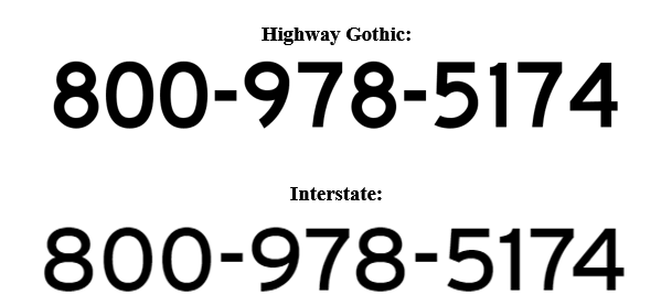
Your phone number is the most important element of your real estate sign’s lettering, so consider using what the highway sign experts use:

Since “better legibility is obtained by using a relatively wide spacing between letters,” according to the U.S. Department of Transportation, the Interstate font seems to be the best choice.
Not all agents can choose their real estate signs. If you can, use the space wisely.
And, if you work under a broker who insists that the phone number on a real estate sign can’t be larger than the broker’s name, it’s time to strike out on your own.

Get the “Listings Playbook” Today!
Knowing how to find listing leads is one thing. But knowing how to engage them with confidence is something else entirely. Don’t wing it. Stick to the script.
Download our free “Listings Playbook,” where you’ll learn how to identify the tools already in your arsenal that you can leverage to engage, nurture, and convert leads. Plus, you’ll get a handful of scripts that you can easily customize to fit your voice and the channels you’re using to get more listings.
Submit your email address below to have this free guide sent to your inbox!
 800.978.5174
